Tera X Relative FW
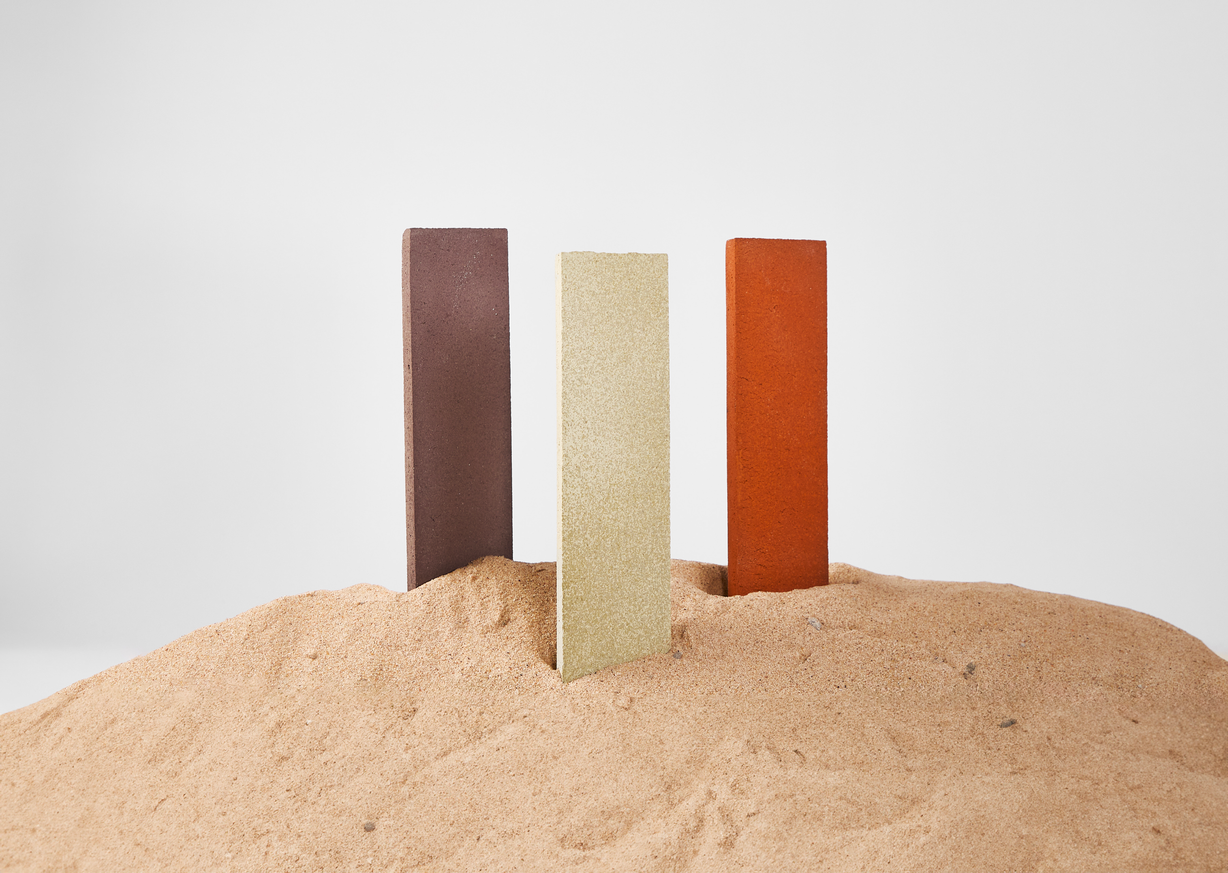
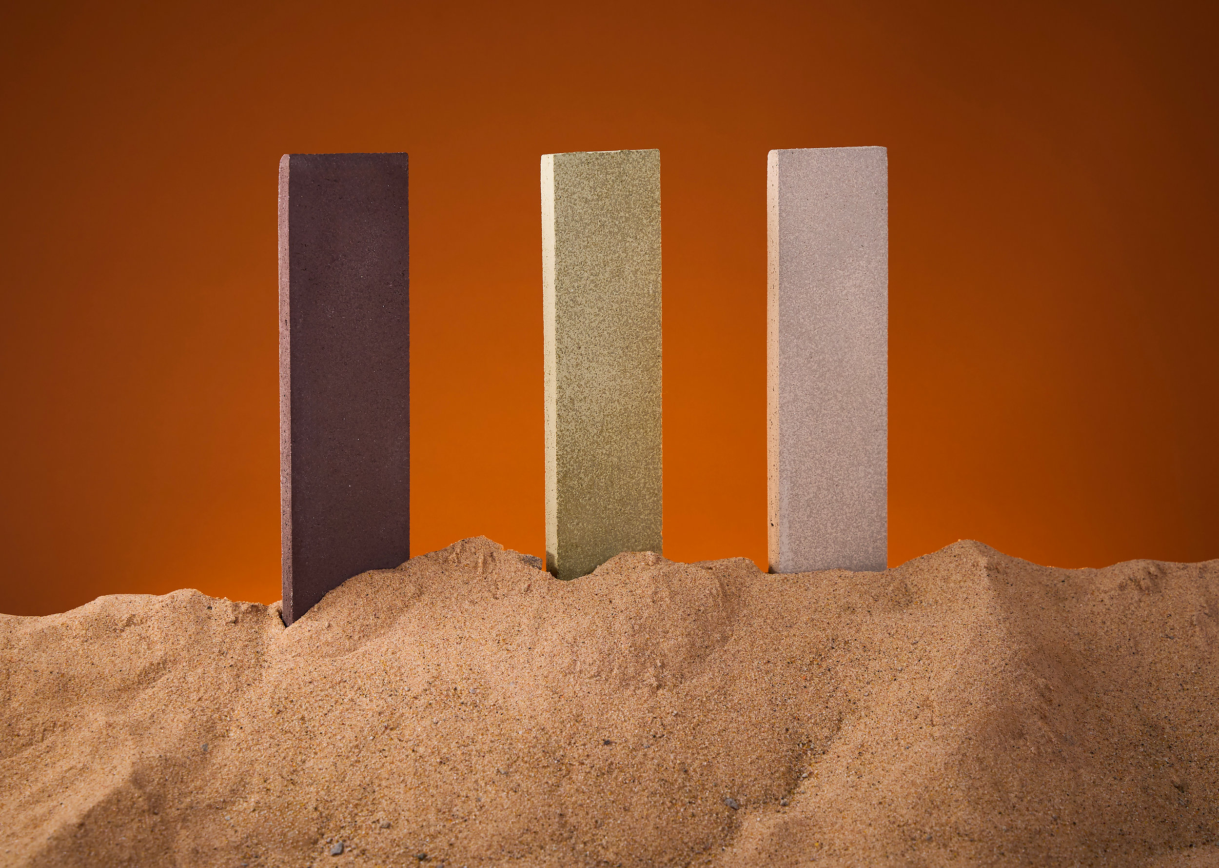
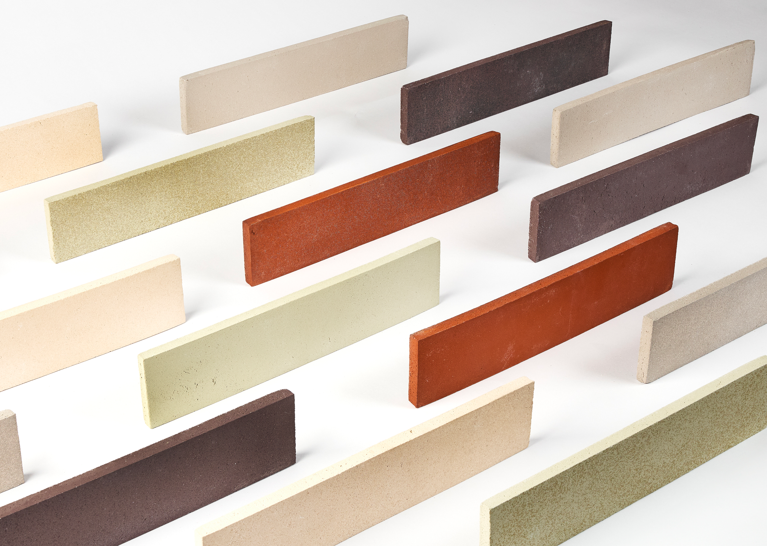
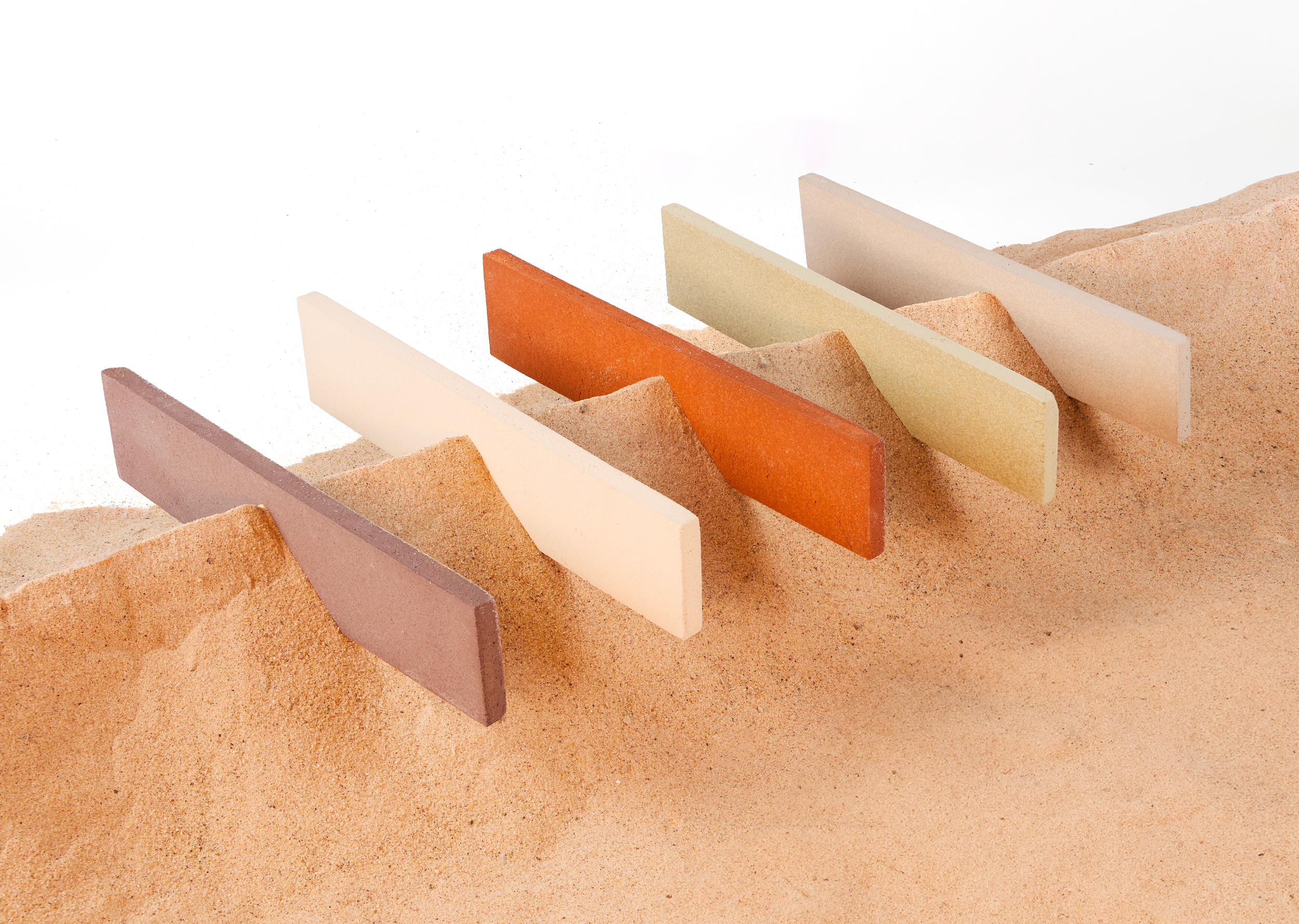
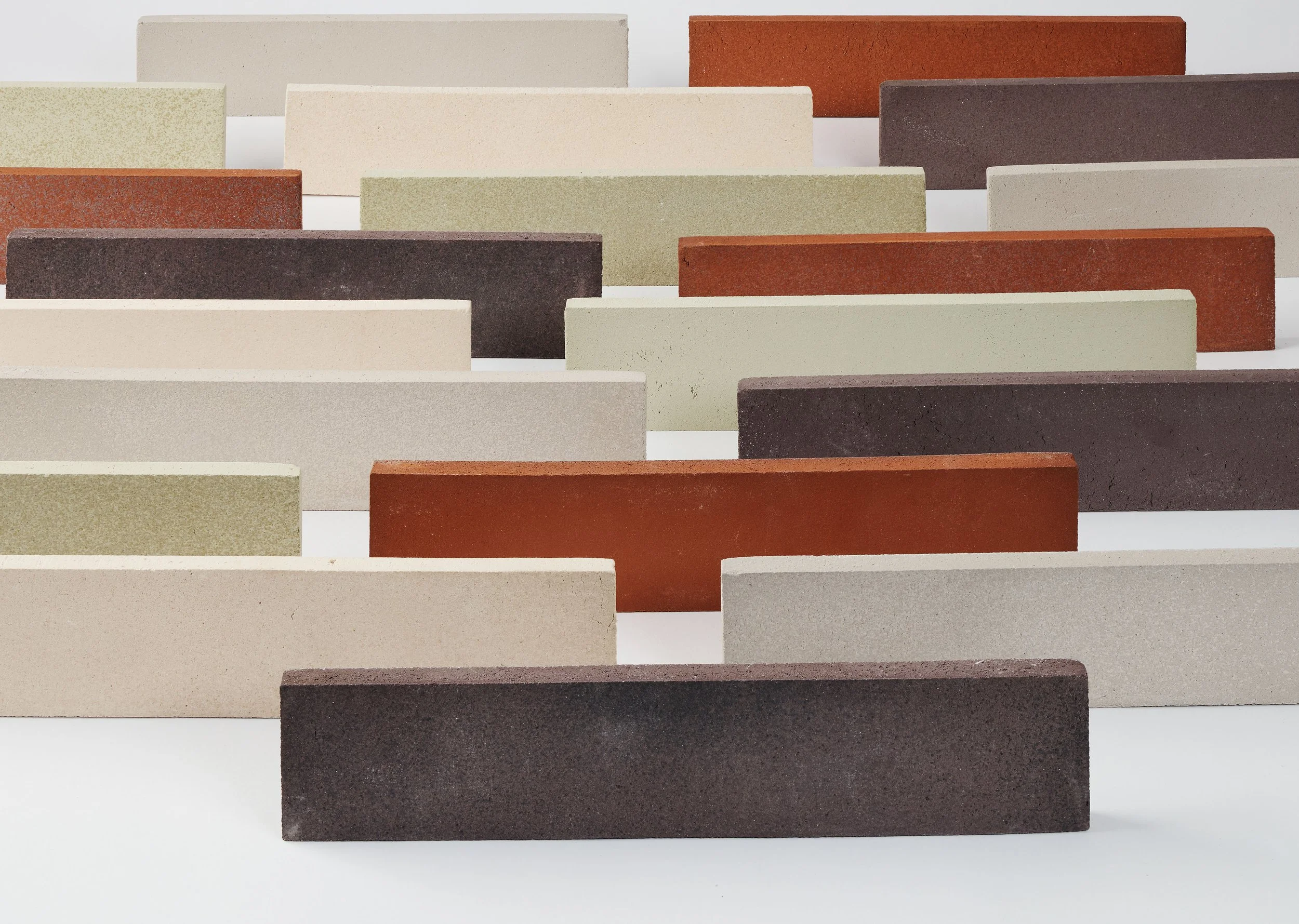
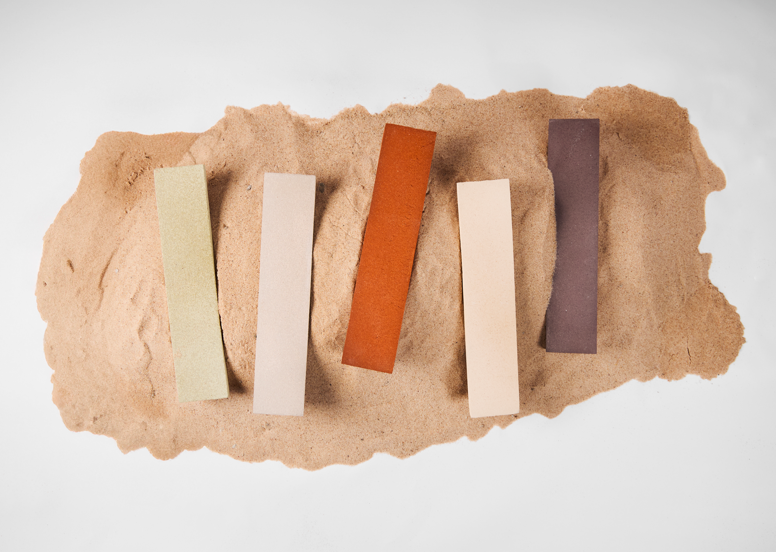
The shooting translates the essence of earth and sand into a visual narrative. Through textures, tones, and material-focused compositions, it highlights the collection’s granular surfaces, natural variations, and depth, emphasizing authenticity, craftsmanship, and the raw beauty of ceramic material.
-
Tera is inspired by earth, and more specifically by sand as its most essential form. Sand is the foundation of ceramic material, a natural element that represents origin, simplicity, and transformation.
This connection is reflected in the collection’s surfaces, defined by subtle granular textures and natural tonal variations. Handcrafted colored refractory clays, combined with full-body color, create visual depth while ensuring durability and performance, maintaining an authentic, material-driven aesthetic.
The name Tera, meaning “earth” in Italian, reinforces this direct link to raw material and its purest expression, resulting in a versatile and contemporary surface collection.
-
Shoot produced for Relative Floors + Walls.
Creative Direction: Lorena Ceresoli
Photography: Bryton Garay
Photography Assistant: Paola Mendiola
Year: 2026
Website: https://relativefw.com/ -
I led the project from concept to execution, shaping the creative direction and developing the visual narrative. I defined the image concepts, directed the shoot, curated the final image selection, and guided the team to ensure a cohesive and impactful outcome.